디프디큐(THIS. Professional Design Curator) 32

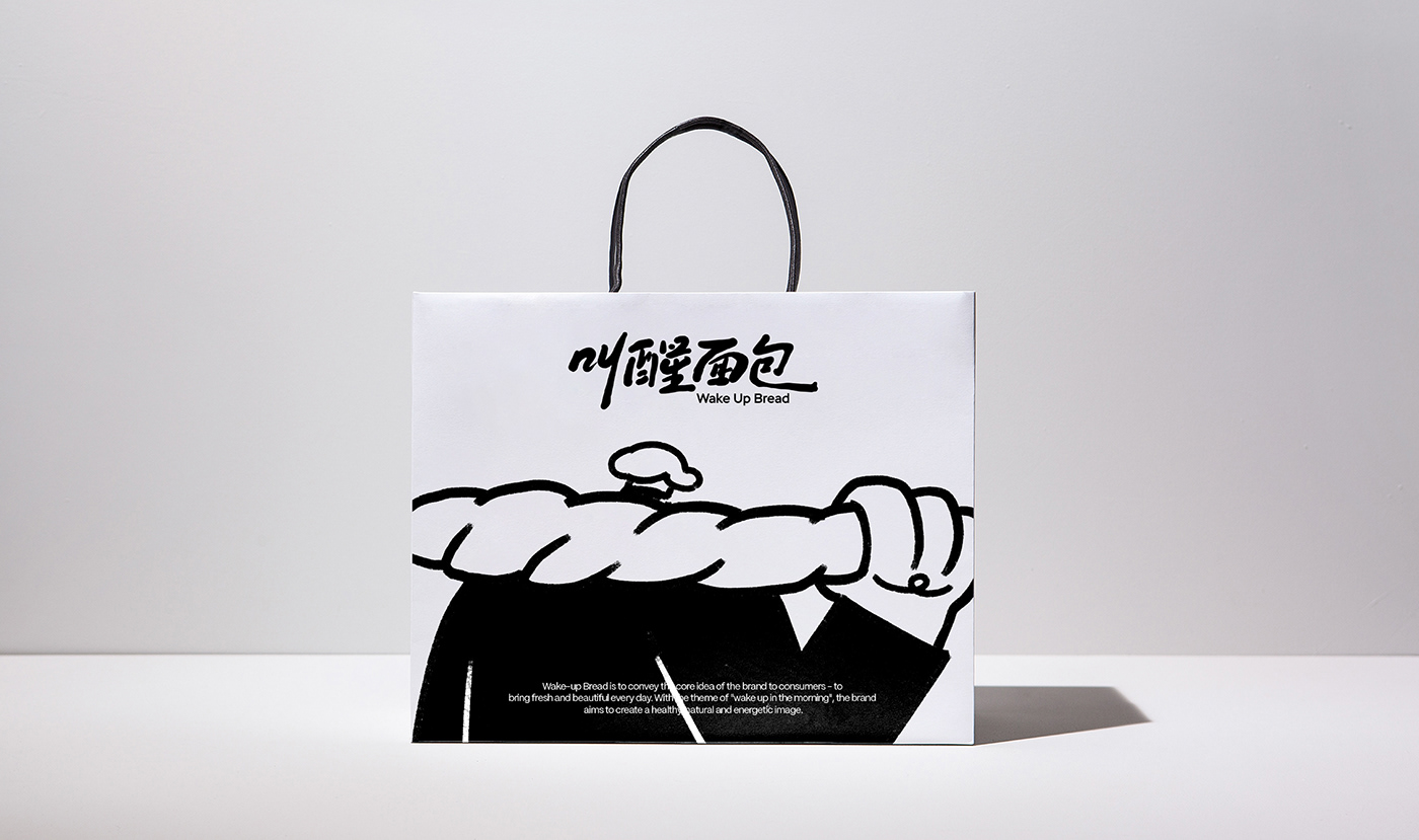
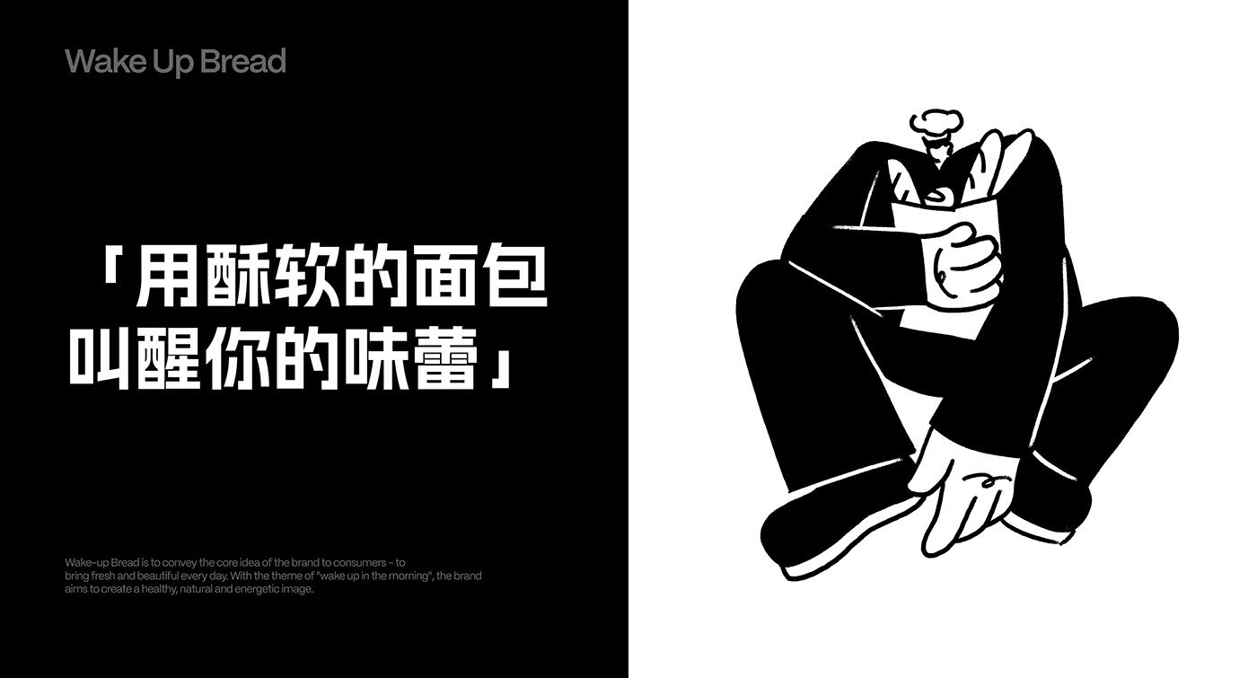
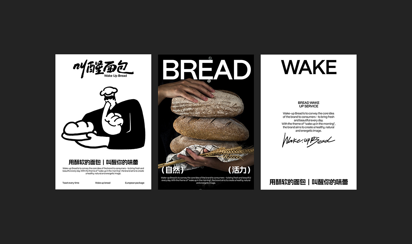
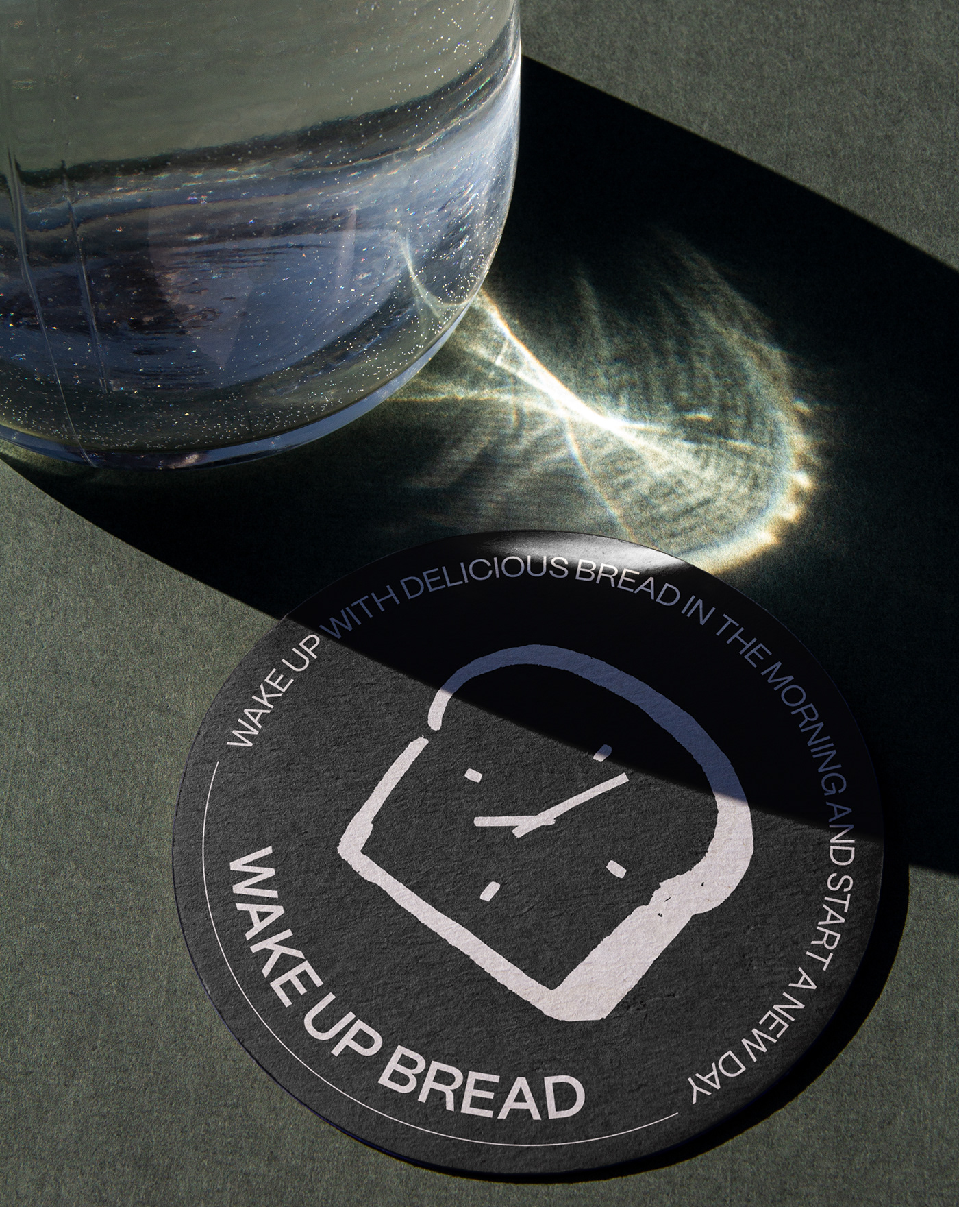
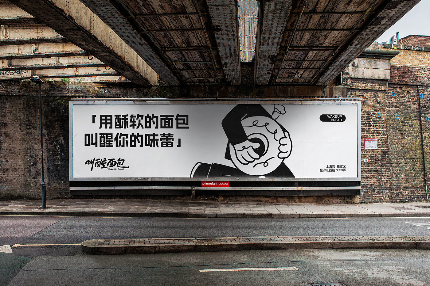
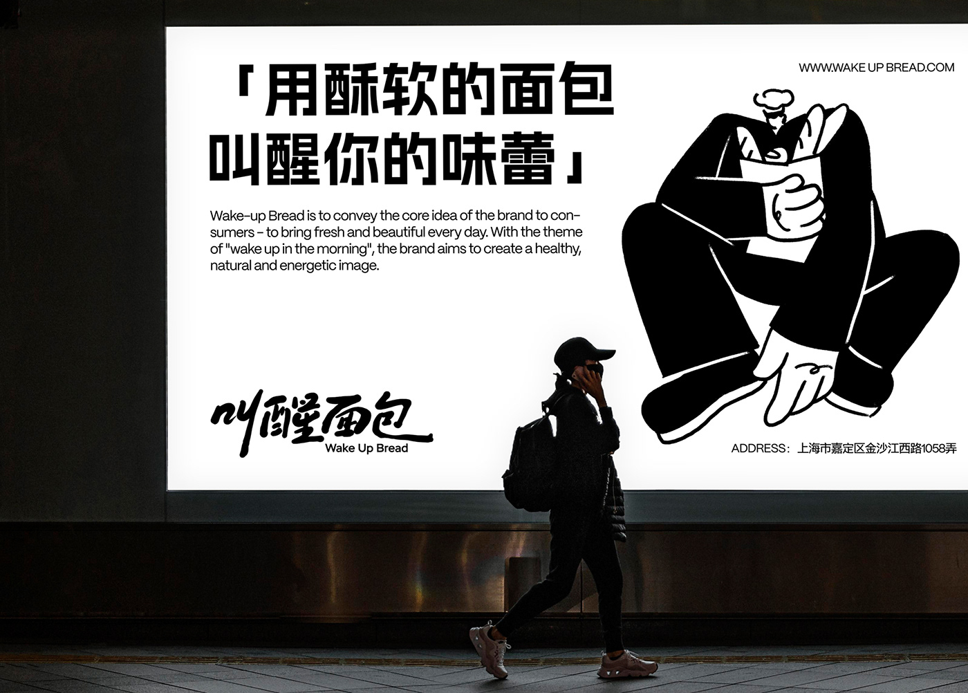
Wake Up Bread is a bread bakery located in Shanghai, China. Our brand concept is to allow everyone to wake up with delicious bread in the morning and start a new day. We believe it is not just a food, but a symbol of a lifestyle. We believe that everyone deserves a good start, and the taste of waking bread,
This is a wonderful beginning. We are committed to using the freshest, highest quality ingredients, handcrafting each loaf and infusing it with our unique creativity and passion to create a wide variety of tastes and flavors. Our bread is not only delicious, but also full of artistic flavor, each piece of bread is a work of art.

叫醒面包是一家坐落在中国上海的面包烘焙店,我们的品牌理念是让每一个人在清晨都能被美味的面包叫醒,开始全新的一天。 我们认为不仅仅是一种食物,更是一种生活方式的象征。我们相信,每一个人都应该有一个美好的开始,而叫醒面包的味道,就是这个美好的开始。 

我们致力于使用最新鲜、最优质的原材料,手工制作每一份面包,并注入我们的独特创意和热情,以创造出各种各样的口味和风味。我们的面包不仅美味可口,而且还充满了艺术气息,每一份面包都是一件艺术品。
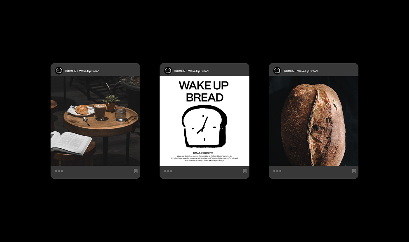
branding  brand identity Packaging visual identity brand identity visualization Identity Design Food  design

Wake Up Bread

중국 상하이에 위치한 빵집으로 붓터치가 확실하게 살아있는 그림을 비주얼로 삼은 브랜딩입니다. 이 빵집의 컨셉은 모든 사람들이 아침에 맛있는 빵과 함께 새로운 하루를 시작할 수 있도록 하는 것입니다.

다른 브랜딩과는 다르게 드로잉 느낌이 확실합니다. 기업의 깔끔한 브랜딩과 확실하게 차이가 나는 스타일의 작업입니다. 하지만 이렇게 훌륭한 개성넘친 드로잉이기에 서체는 단조로운 고딕체를 사용하여 그래픽의 복잡함을 중화해주고 있습니다.

흑백에 별다른 컬러를 사용하지 않았음에도 충분히 빵이 가지고 있는 따스한 색감이 더 부각되고 있습니다. 그래픽 자체가 붓터치도 있고 선이 매끄러운 편이 아니기 때문에 여기에 색을 입혔다면 상당히 피로감이 있었을 뻔 했고, 이런 회화스러운 느낌이 덜했을 것입니다.

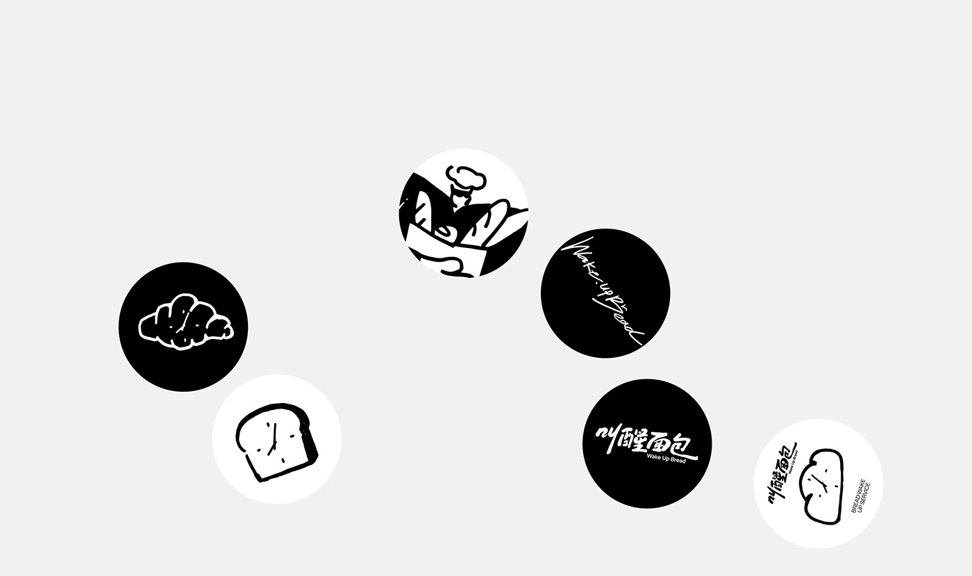
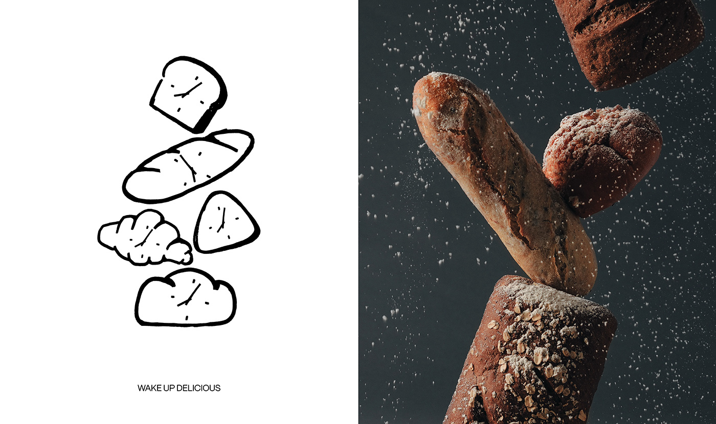
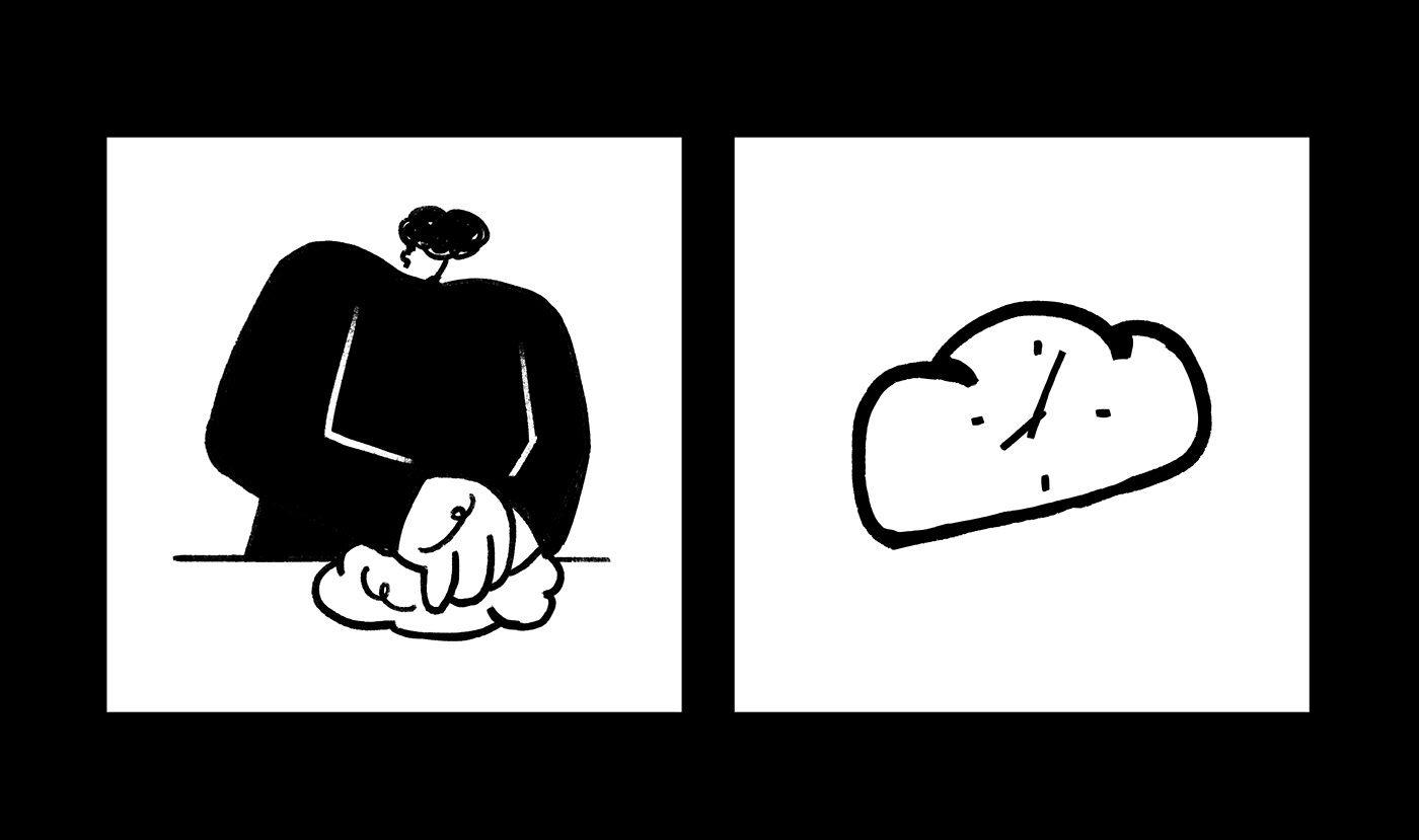
흑백의 조합이기 때문에 먹과 종이의 동양적이고 힘찬 붓터치가 더 부각되어 보이고 있습니다. 아침이라는 키워드가 있기 때문에 시계를 빵에 그려넣어 아침시간을 묘사하고 있습니다. 확실히 개성있고 재밌는 그래픽입니다.

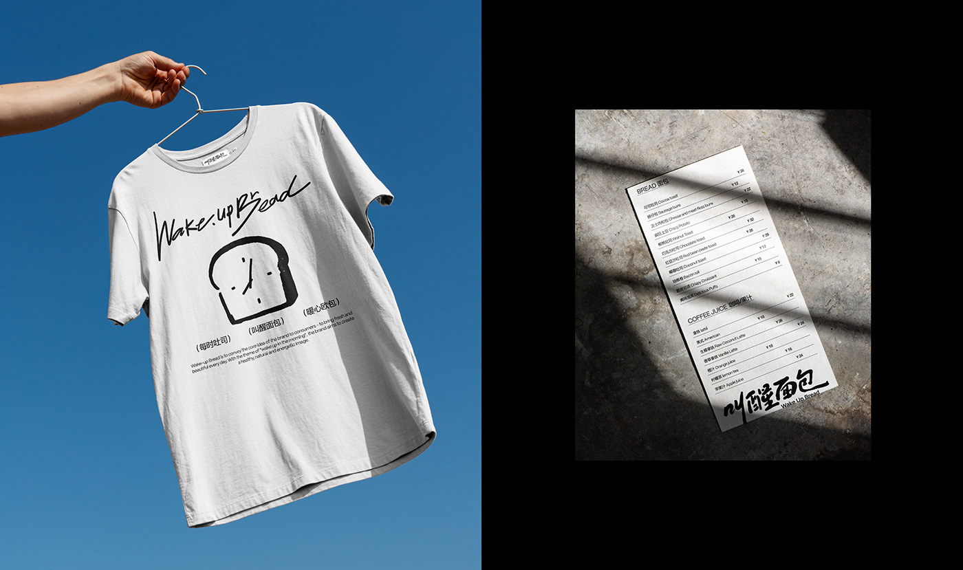
목업도 보면 무조건 빵이 있거나 빵집이거나 하는 상황은 없습니다. 오히려 너무 평범하고 음식과 거리가 있는 깨끗하다고 말할 수 없는 골목에 목업을 구현하고 있었습니다. 이미 그래픽 내에서 어떤 기업인지 명확히 알려주었기 때문에 목업 사용 시, 그래픽들을 더 자연스럽게 부각시키는 방향으로 제작한 거 같습니다. 이미 사람 그림이나, 빵 그림, 시계를 통해 브랜드에 대한 설명은 그래픽 내에서 명확히 끝낼 수 있었습니다. 이를 토대로 한다면 목업를 선택할 때, 빵이나 요리같은 걸 표현하기 보단 일상중에서 출근하는 사람들이 많이 볼 수 있는 길이나 도로를 중점적으로 묘사한 것으로 추정됩니다.

비주얼 요소는 브랜딩에 핵심적인 부분이지만, 먼저 브랜드의 초기 기획을 한번 떠올릴 필요성이 있습니다. 이 비주얼 요소는 지금 브랜딩 작업에서 어떤 곳에서 파생됐고, 그 뿌리가 무엇인지, 누굴 타겟으로 했는 지 등을 고려한다면, 단순히 브랜드에 맞다고 빵이 가득한 초현실적인 사진에 그래픽을 넣는 것이 아닌 먼저 보여주고 싶던 그 느낌을 살려 타겟층에게 확실히 인지하거나 최소한 어렴풋이 느끼게 할 수 있다면 그것이 소비자에게 친근감을 준 브랜딩이 아닐까 하는 생각이 듭니다.

叫醒面包Wake Up Bread Brand Visual Design :: Behance

Study Calendar