https://www.behance.net/gallery/55624909/COLONY-Brand-Identity-Implementation
Project — COLONYClient — The Northern Group
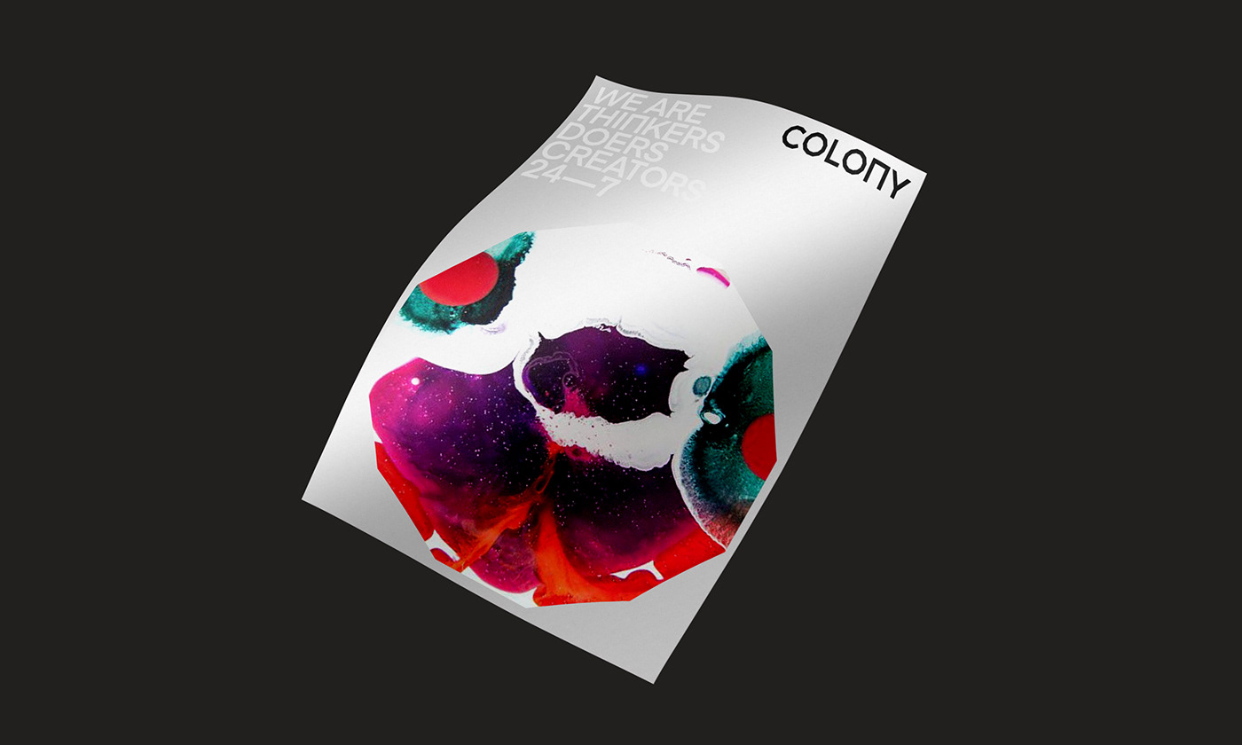
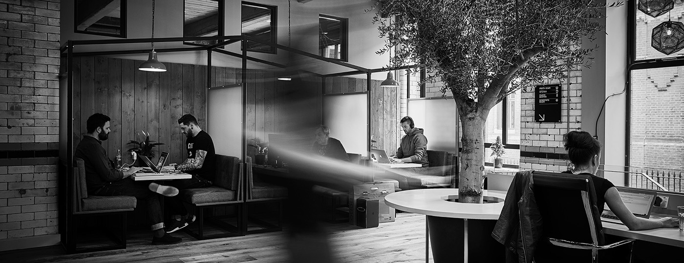
Colony approached with an exciting concept: to create a co-working space that felt like home to creatives—somewhere exciting to be—somewhere with soul. They wanted to build a space that was full of colour and grew with every new member, allowing them to leave their own imprint on the space and even the brand.
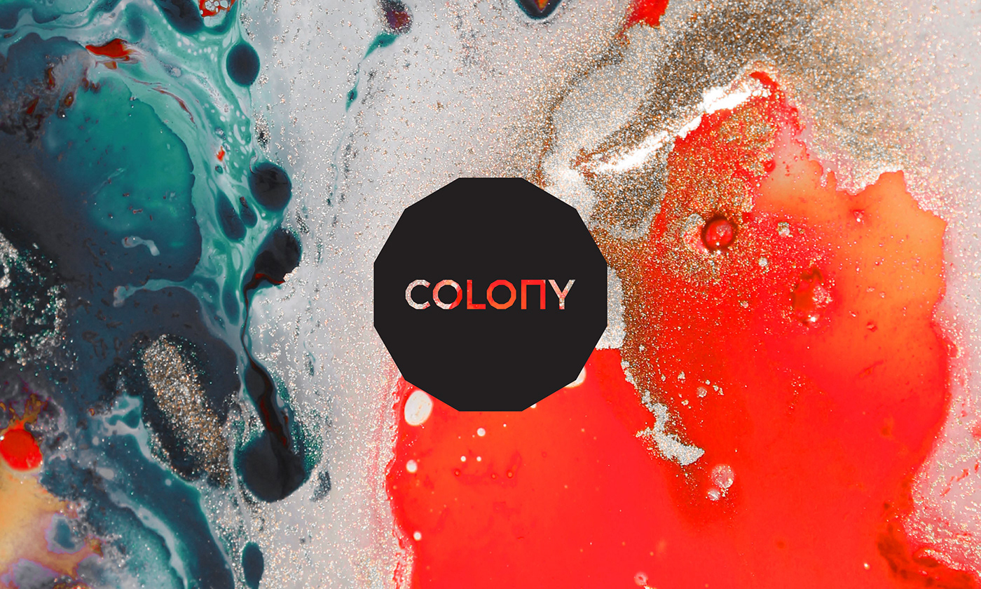
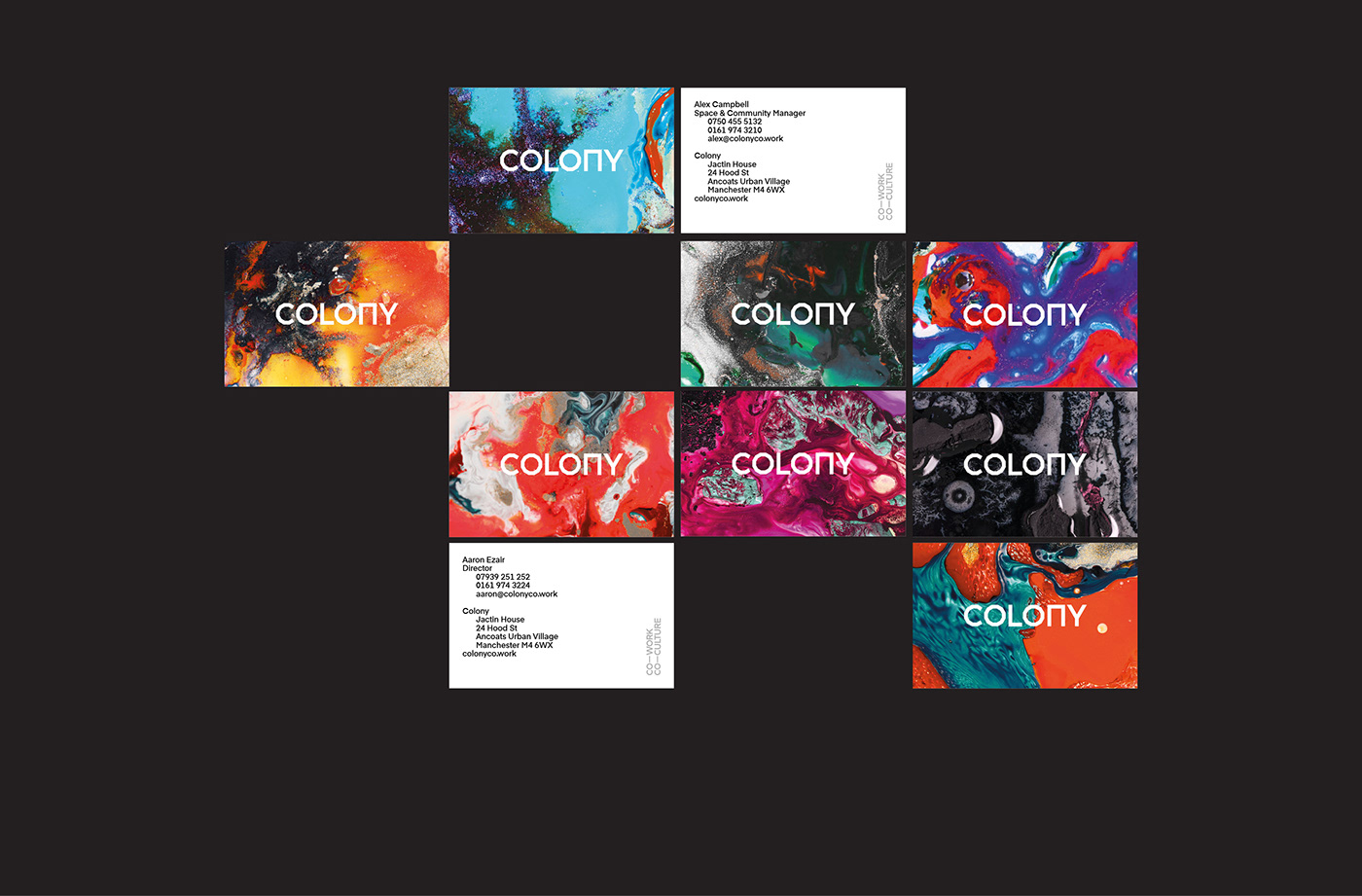
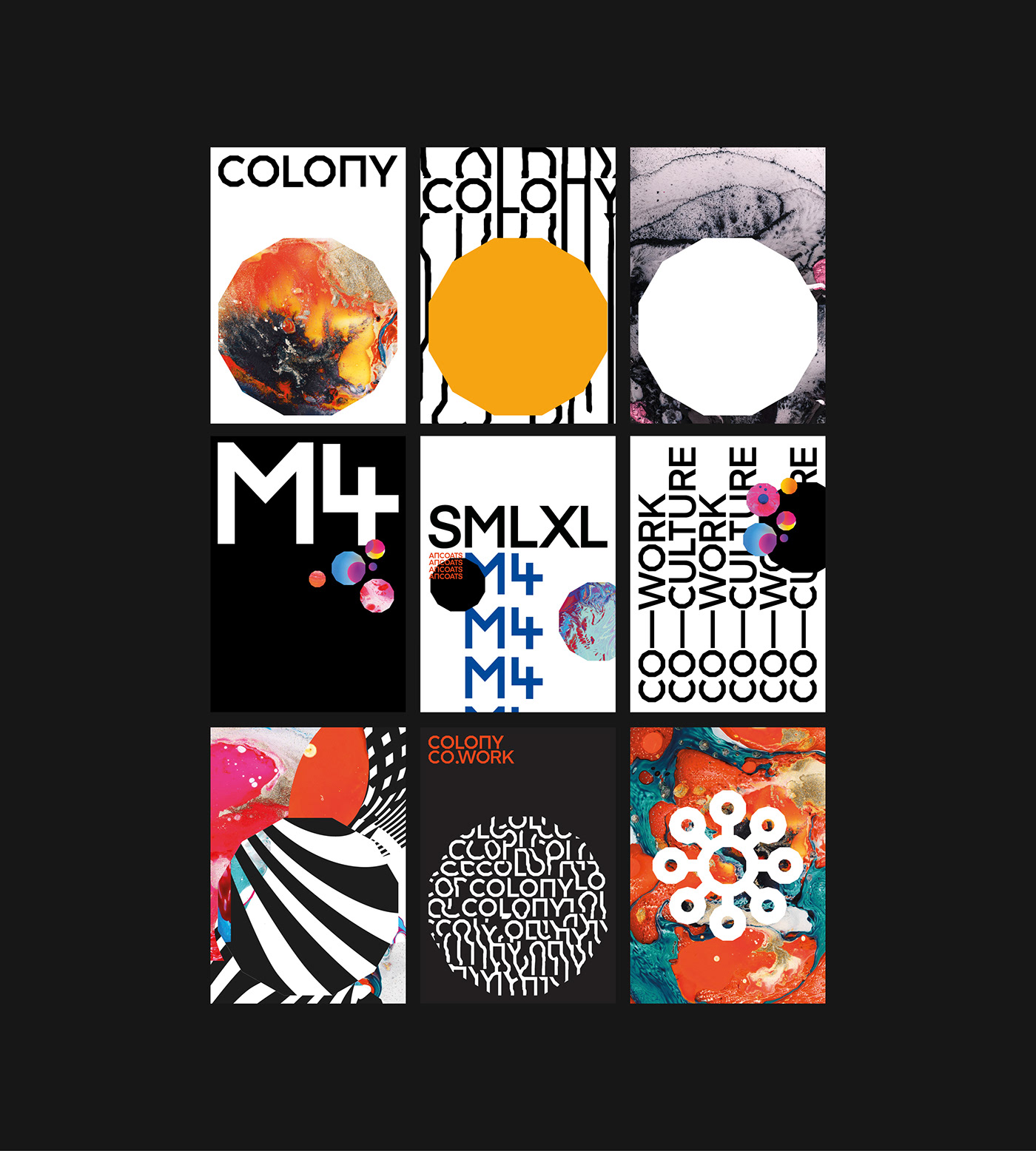
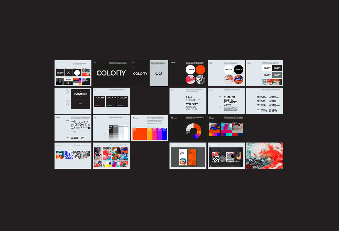
Research showed us that the triggers for members centred around two key areas: collaboration and growth. Pairing that with the client goal to create further sites, we built the identity around the concept of ‘Cellular Growth’ and began to develop the visual language of germination and chemical reactions.


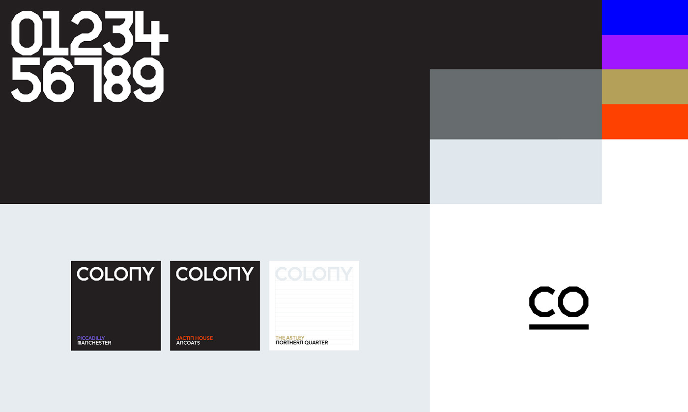

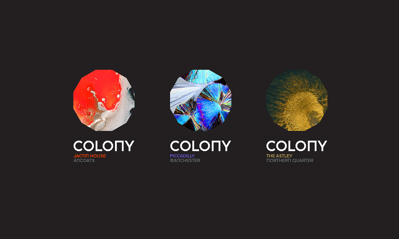
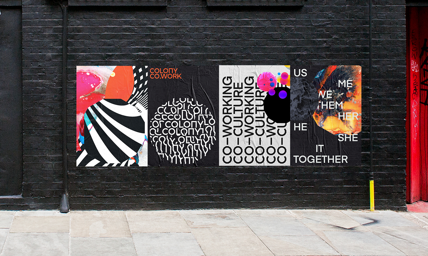
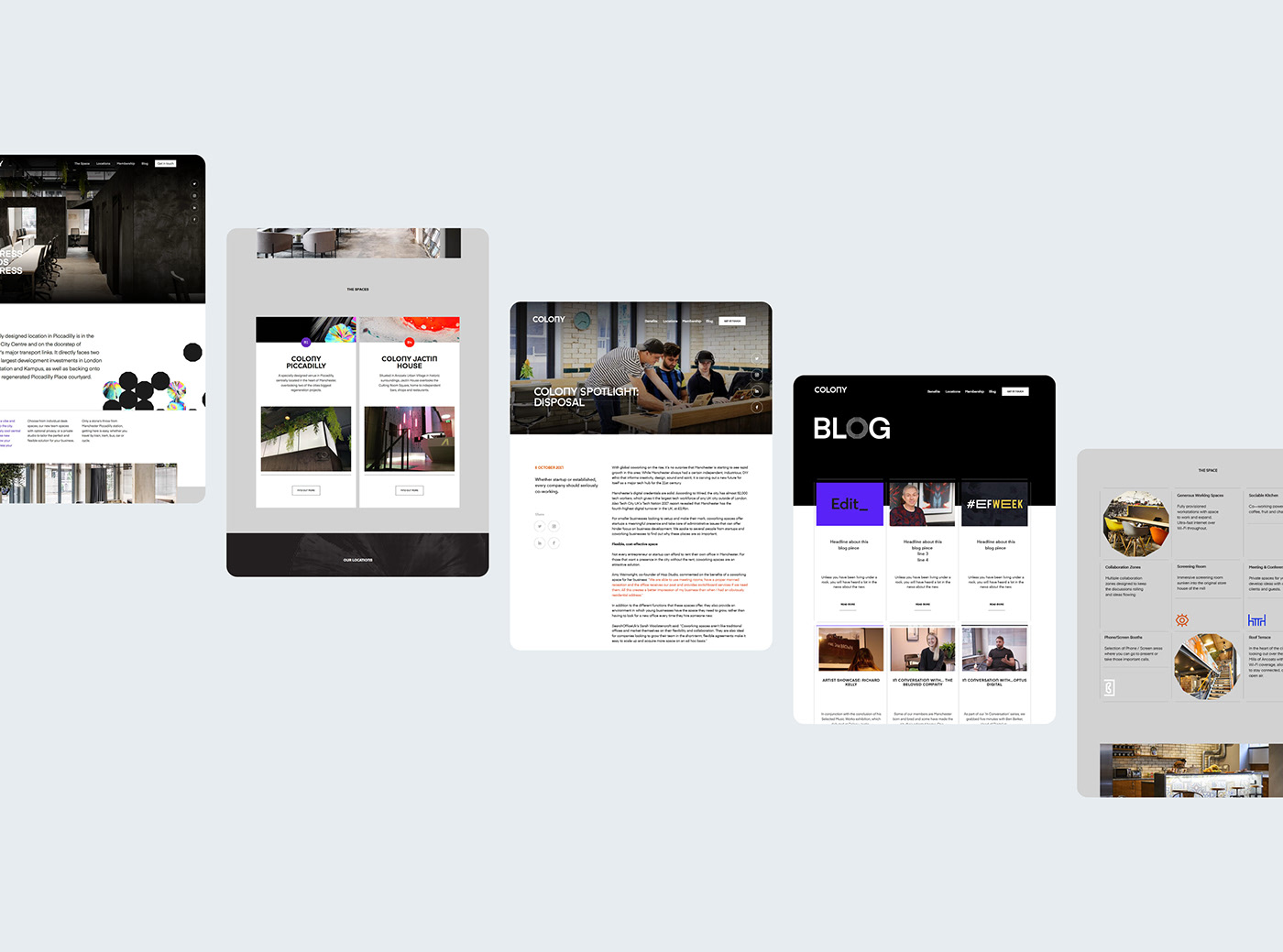
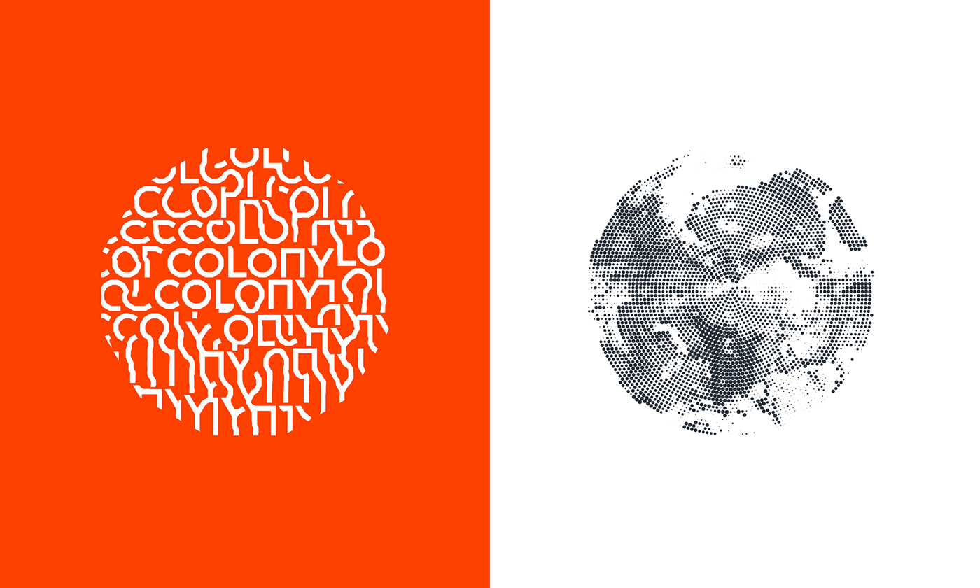
We wanted to make sure that the brand could stretch across further sites without becoming diluted and acting as wallpaper, so we created imagery bespoke to the location, with the knowledge this would evolve as the brand did. To ground this, the constant was a simple core kit of component parts – the identity, a signifier (a 12-sided symbol we coined the Petri Dish), iconography and bespoke typography.
We were conscious to create an identity that didn’t overtly reference a ubiquitous symbol within the city of Manchester (particularly within this sector) – the worker bee. Instead, a visual language was developed which transient and fluid germination through the chemical reactions, yet always grounded with the core components and identifiable as Colony.


Concept, Brand and RolloutEnsemble
Instagramweareensemble.co.ukhello@weareensemble.co.uk