https://www.behance.net/gallery/89388403/Its-Time-To


It’s Time To was founded in 2007 and now has more than 300 stores. The purpose of this rebranding is to respond the future development plan for the next decade, to make the brand temperament younger, more dynamic, and to achieve a high degree of unity in tonality.
-ART DIRECTOR: Nod Young / Guang Yu
DESIGNER: Liao Liao® 2019 A BLACK COVER DESIGN, INC.


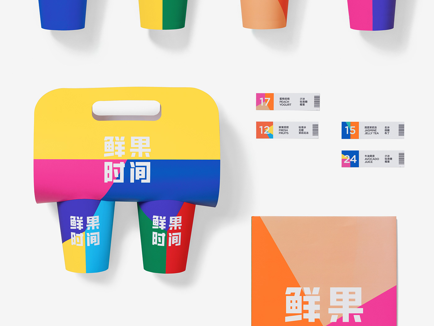
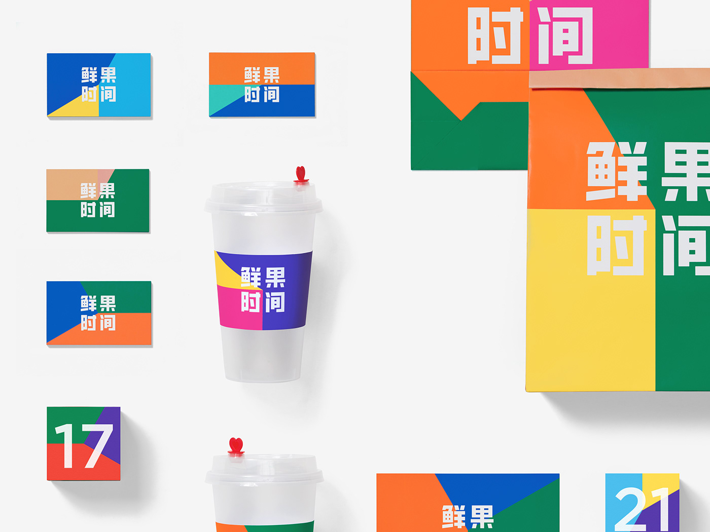
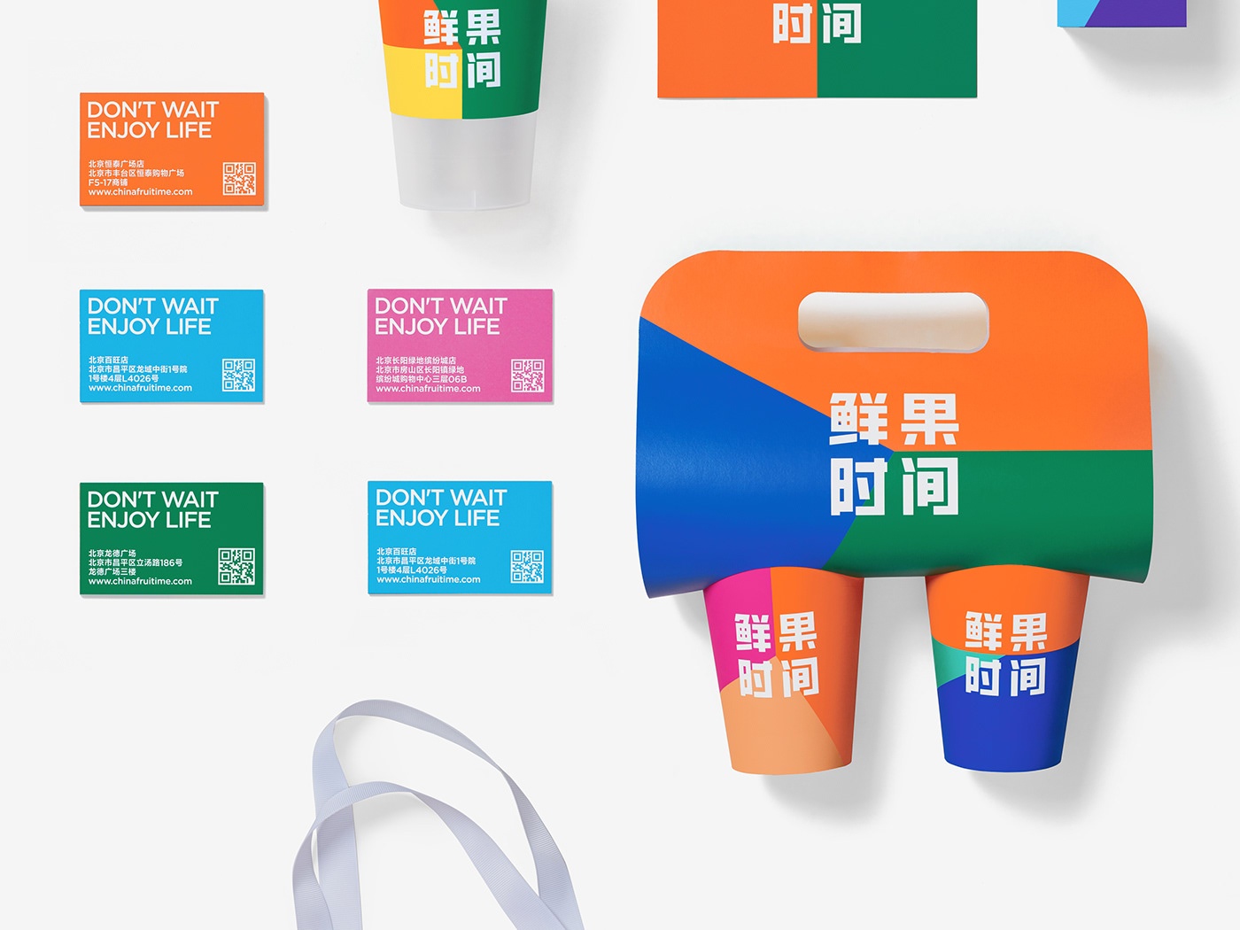
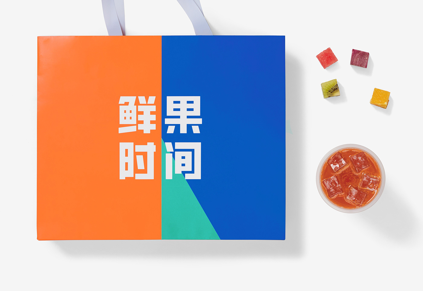
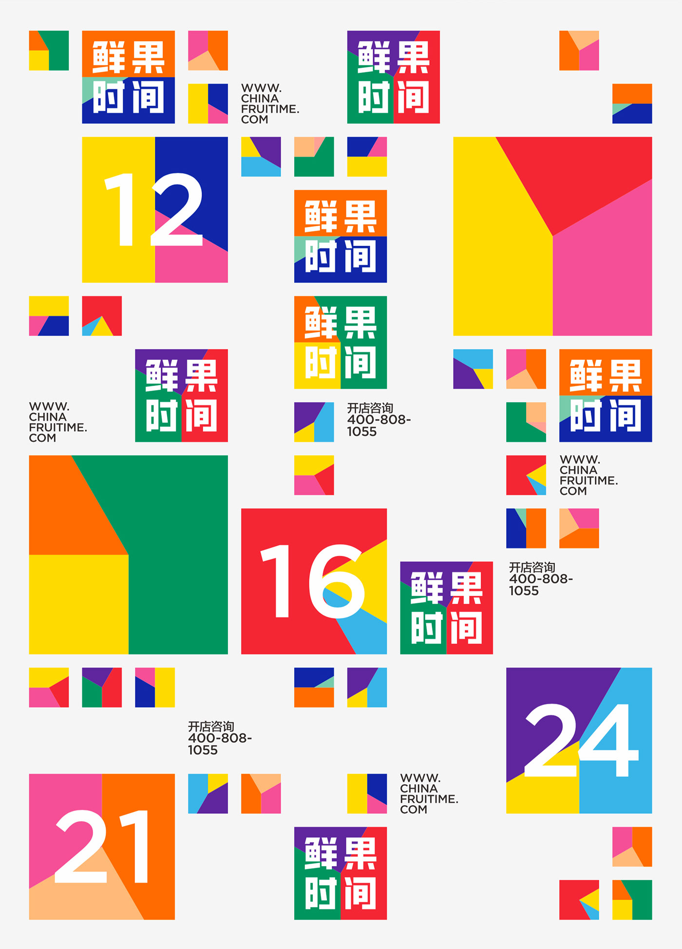
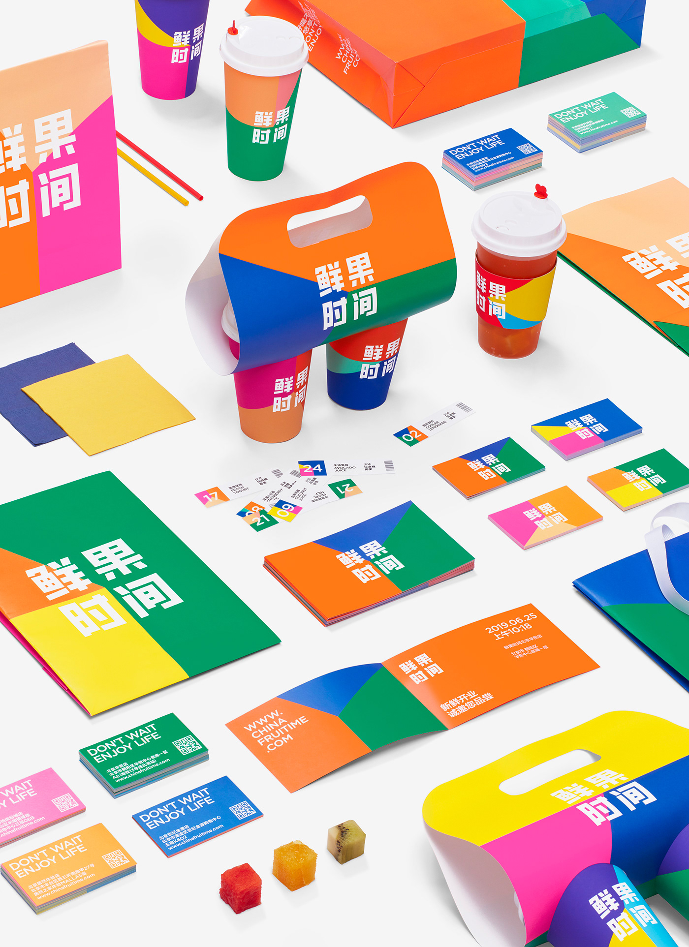
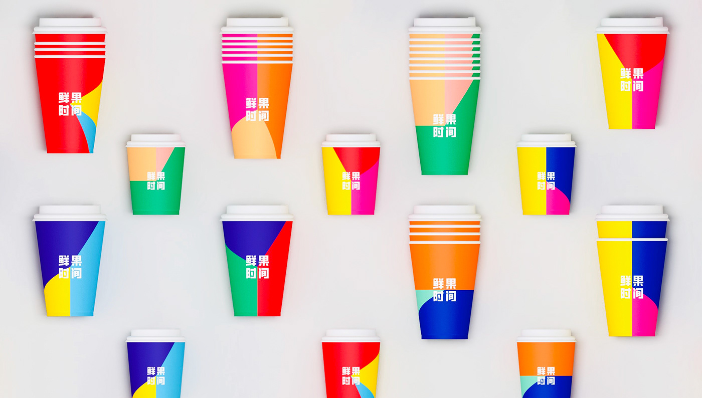
Due to the large number of stores, the future maintenance cost must be effectively controlled, so we introduced the design method of system building. In the concrete presentation, “fresh fruit” and “time” are described respectively.
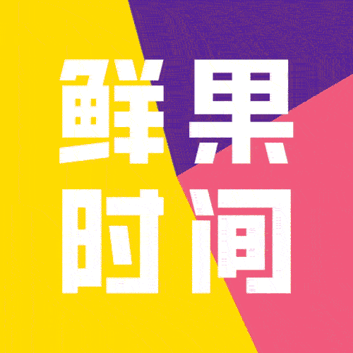
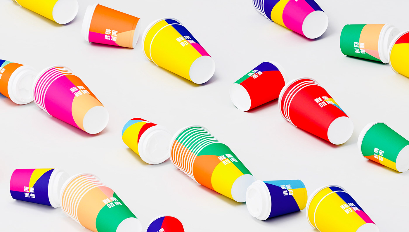
Among them, the color relations correspond to “fresh fruit”, and the adjustable proportional relationship between the three sectors means “time”. As time elapses, there are different color combinations, and the logo has been in a state of flexibility and freedom.
The derived visual identity system is rich and diverse with an extremely high recognition degree. On the other hand, the high purity and contrast in the color relationship also triggers an intense psychological implication, producing a refreshing, sweet and sour taste experience, fresh, delicious, and naturally integrated into the underlying gene of the brand.